
We're on a mission to
end ai design slop
Get started
All of the vibe-coding tools lack design taste.
We're building the design taste layer for vibe coders.
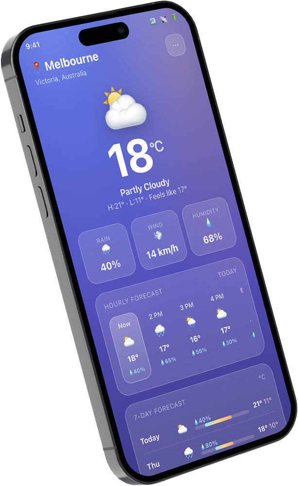
Violet to magenta at 135°. The default hero since the first text-to-app demo.
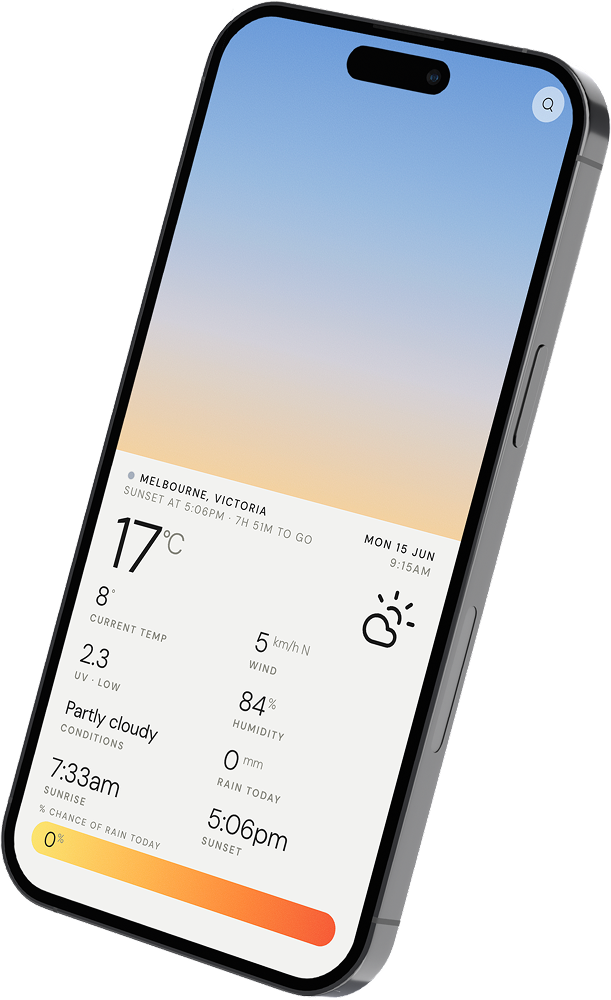
"Tasteful minimalism" flattened into oatmeal. Safe, soft, forgettable.
Blur it, drop white to 16%, add a hairline. Then do it to every card.
Rocket, sparkle, fire, bolted onto every H2 to fake enthusiasm.
Inter for the body, Inter for the display, Inter for the logo.
Hero copy marooned dead-centre, because alignment is a decision.
Every feature crammed into a grid of rounded boxes.
A neon box-shadow halo, begging to be clicked.
Sound great to you? Sign up!
Design products that don't look AI-generated
You can prompt a working app in an afternoon. It'll look like everyone else's.
umamii is the design & taste layer that makes it look like yours.
Just a bunch of humans who care about good design.
We're a small team from Envato, designers and builders who got tired of seeing the ai design slop the same way you did.
We couldn't unsee it, so we started building the fix.

Want to come along for the ride?


Wondering if your app looks ai-designed?
Our free audit scores your screenshot for slop tells and writes a fix for each one that you can paste straight into your coding tool.
Audit a screenshot